Generally a film has about 90 minutes to establish its characters, enigmas, narrative, ideologies, themes and iconography, before it is then expected to wrap everything up into a neat package and have the audience leave the cinema satisfied that everything has been tied up. Let's just think about what a massive undertaking this is. In the length of one of your Media lessons, a filmmaker has to create an entire world, and has to ensure the audience is as entranced by this world as she was making it.
One of the most effective ways to 'hook' an audience right from the start is through an effective
title sequence, and in particular, an effective
title card. Audiences are already aware of the title of the film before they begin to watch. Yet, they are often unaware of the scope and connotations of this title. By
situating the title in a certain context, on a certain background, using certain colours and certain fonts, the filmmaker can completely change an audience's perspective on what the film is going to be about.
Put simply, a title card is a
framing device which
anchors the audience into a particular way of thinking. Often, a person will be employed whose
sole job is to construct the title sequence of a film. In many cases, the title card can be
synonymous with the film itself.
Let's take a look at some excellent title cards. As you go through the list, consider how they
anchor the audience into a particular way of thinking. You can click any image to see it in full size.
 |
| Sunrise (Murnau, 1927) is fairly typical of the simplicity of early 20th century title cards. Here the director, a German emigre, has added a typically expressionist flourish with the hand painted title. This connotes the passion and emotional melodrama of the film. |
 |
| Gone With The Wind (Fleming, 1939) finds the producer experimenting with the possibilities of title cards. In order emphasise exactly how 'big' this film is, the title is vastly too large to fit on screen , instead rushing on from screen right. The font emphasises the sheer force of the title, as if the wind itself is dragging the letters. |
 |
| Many other directors have played with the idea of the title being 'too big' for the screen. Shinya Tsukamoto's low budget cyberpunk masterpiece Tetsuo (1989) has the title dragged across in a similar manner, as the main character writhes in agony in the background. Needless to say, a very different connotation is implied here! |
 |
| Many Media theorists would argue that the 'Bond film' is a genre in itself. This is supported by how well defined its iconography is from film to film. These title cards, mainly designed by Maurice Binder, demonstrate the cool, suave and colourful ideology of the early Bond franchise, and is quite different from the darker, more depressing titles of the later films in the series. |
 |
| The simplicity of the caption to Funny Games (Haneke, 1997) is it's greatest strength. Suddenly appearing on screen, and accompanied by discordant, horrible music, it's as if a knife has been held up to the throats of the family... and the audience. By placing the title over the face of the family, and having it come in so suddenly and so shockingly, we are forced to acknowledge it, and desperately try to work out what is actually going on. |
 |
| Joss Whedon, evidently a fan of Funny Games, used a very similar technique in Cabin In The Woods (2012). What's interesting here is the way in which the genre conventions of the title (which clearly suggest a horror film) contrast brutally with what's going on on-screen (two middle aged men discussing what they're up to this weekend). Already, the audience are asking lots of questions about this film! |
 |
| Once more, a brutal effect is created from the opening title. For the title card for Psycho (Hitchcock, 1960), title designer Saul Bass cuts the title into pieces, emphasising the film's brutal violence and the split personality of the antagonist. |
 |
| Saul Bass was famous for his expressive and stylish opening title designs. Working in a variety of genres, Bass was able to anchor the genre conventions instantly, through use of typeface, colour and bold imagery. |
 |
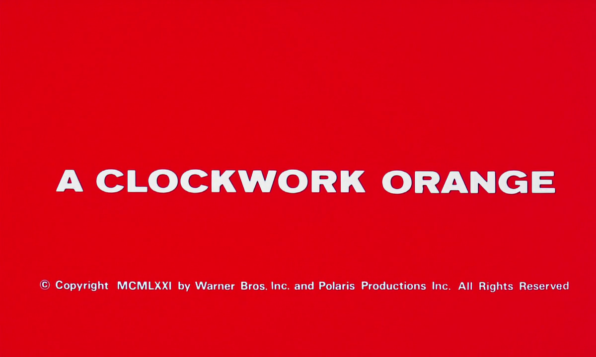
| Opening titles don't always have to be complicated. The title card used in A Clockwork Orange (Kubrick, 1971) shows a director confident that the controversial reputation of the film speaks for itself. The use of red has many connotations, broadly either love or death, and the audience is left only with the bizarre and contradictory title, subtly creating an alienating experience. |